When should we use beautiful 3D objects and animation? They are not just for visual flair. They are also highly effective when we need to communicate scientific concepts that users may otherwise find unfamiliar or difficult.
In an aurora app, user questions are straightforward: Can I see it now? Is the condition getting better? Do I need to move? That is why I split the UI the same way: global aurora conditions in 3D, local conditions through animation, and complex signals through charts. This post covers how I implemented that in a mobile environment and optimized it for stable operation.
1. 3D Earth with Three.js
Aurora Oval is a map that shows aurora observation probability. Most aurora apps use a 2D map, but I wanted to render that probability on a 3D globe for a more intuitive view. I used the following libraries to build and render 3D objects in Expo.
-
@react-three/fiber: Build a 3D scene with React components three: Rendering core (camera, Material, Shader, etc.)@react-three/drei: Utility helpers such as GLTF loadingexpo-gl: Connect WebGL context in Expo-
r3f-native-orbitcontrols: Touch rotation/zoom interaction control
At first, I tried to preserve the oval as close to the original data as possible for both fidelity and visual quality. But in production Android environments, stutter and performance issues caused app crashes. Here is a one-to-one mapping of causes and fixes.
-
The raw source data used a 1-degree latitude/longitude grid. Rendering all
65,160 points directly caused a sharp increase in memory and rendering cost.
- Fix: Normalize intensity values before 3D rendering, remove data below 20% probability, then apply grid-based compression to reduce point count.
-
Even after that, too many points were drawn simultaneously, and brightness
blending overlapped. The workload often exceeded the 60fps frame budget
(~16ms), causing frame drops.
- Fix: Cap per-layer points, total points, and concurrent energy levels to bound per-frame rendering work.
-
Android WebGL environments have significant device-level context/driver
variance, so burst load could trigger frame drops or context errors.
- Fix: Design error handling with a failure-first mindset. Temporarily disable the aurora layer and retry automatically so the whole screen does not fail.
The main lesson here was clear: improving 3D rendering quality matters, but it must be designed together with performance measures that hold up in real operating environments.
2. 2D Animation with Reanimated and Svg
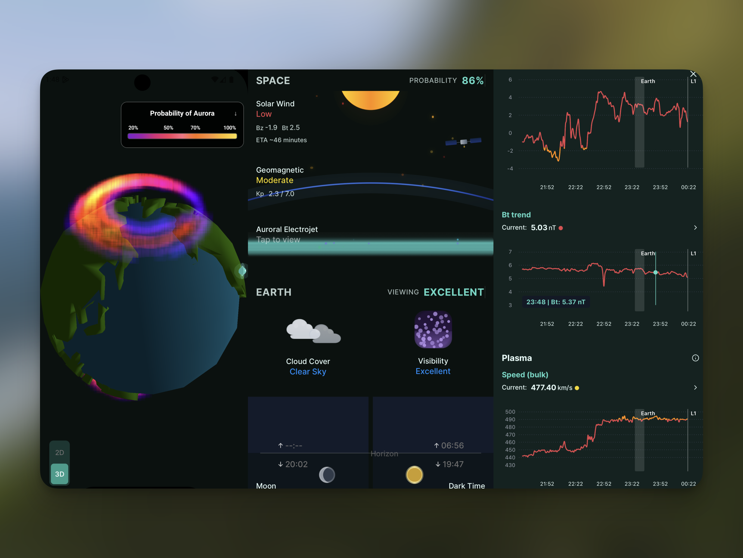
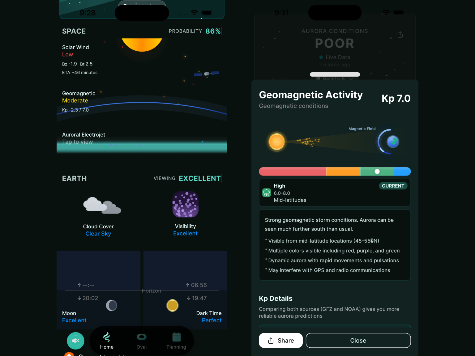
Tracking indicators used in aurora forecasting (solar wind, geomagnetic field, cloud cover) together can improve prediction accuracy around the user's location. However, for beginner aurora hunters, reading these values in real time is difficult. Instead of presenting raw numbers, I structured the view as a real-time 2D illustration that is easier to understand at a glance.
-
react-native-reanimated: Handle card/background/transition motion on the UI thread -
react-native-svg: Render vector illustrations and particle layers
A key advantage of react-native-reanimated is that animation
computation runs on the UI thread (worklets), not the JS thread. So even when
the JS thread gets briefly busy with network responses, state updates, or
logging, frame loops for card transitions, background motion, and star
twinkling remain relatively stable.
The strength of react-native-svg is expressive power and
extensibility. Elements like aurora bands, solar-wind particles, and
geomagnetic curves can be built precisely with Path,
Line, Circle, and LinearGradient.
Reusing the same shape structure also helps keep the 2D forecast screen
consistent across changing intensity/speed conditions.
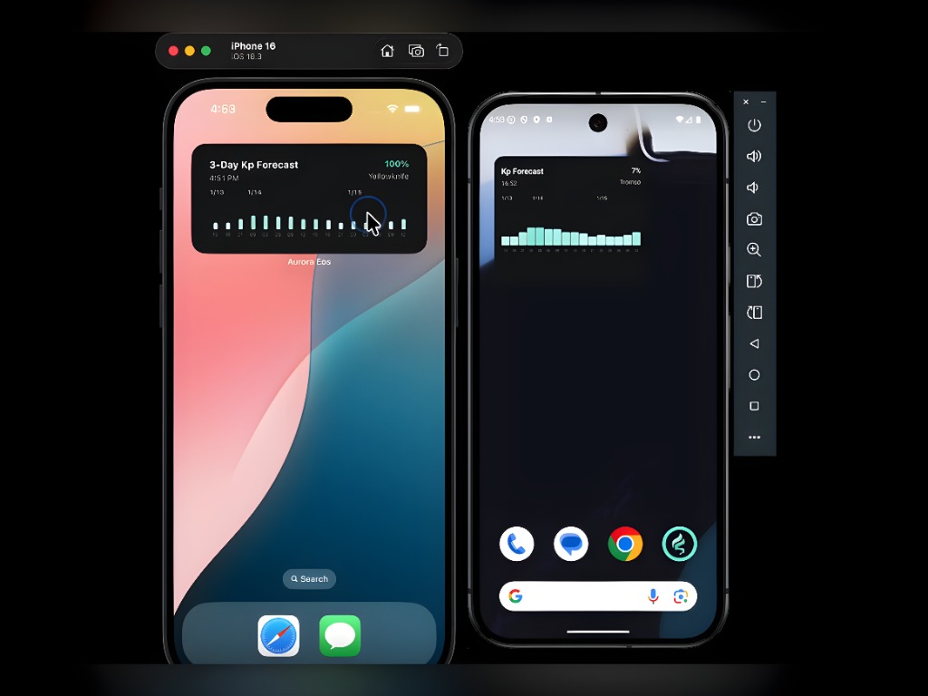
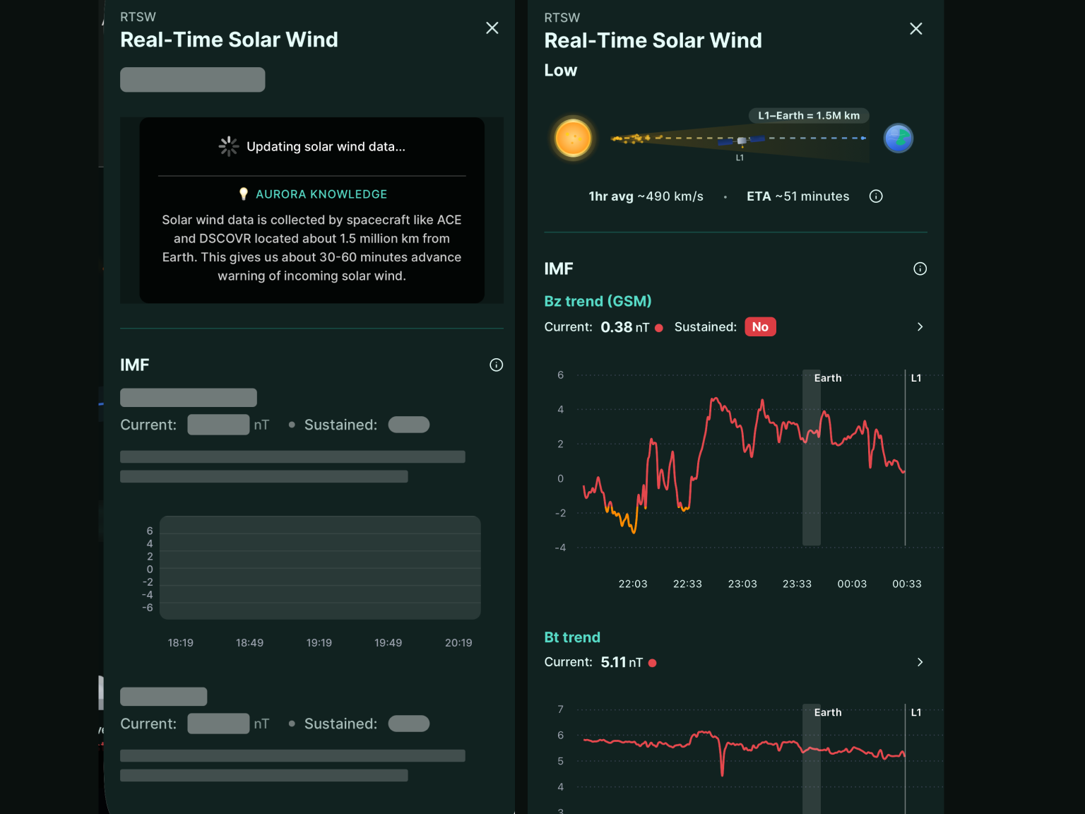
3. Solar Wind Chart with react-native-gifted-charts
-
react-native-gifted-charts: Render solar-wind time-series lines (speed/density/Bt/Bz) with pointer interactions -
LazyMount + Suspense: Delay mounting heavy chart/illustration blocks and use skeleton fallbacks to distribute initial load cost
I chose react-native-gifted-charts because it quickly provides
core chart features such as lines, axes, grids, and pointers. That let me
focus on solar-wind interpretation UX instead of building a chart engine from
scratch. It is also easy to extend with pointer events, line styles, and
tooltip/overlay behavior based on screen intent.
For screen composition, I heavily used LazyMount + Suspense.
Rather than rendering everything at once on screen entry, sections mount
progressively based on data readiness and visibility. The same strategy worked
not only for solar-wind charts but also for animations, illustrations, and
other heavy views to effectively spread initial rendering cost.
Closing Thoughts
The biggest takeaway from this work was that cross-platform apps need performance design that adapts to diverse runtime conditions (OS and device variability). It is hard to solve everything at once, but the key is maintaining a practical balance between service stability and user experience.